0 Comments
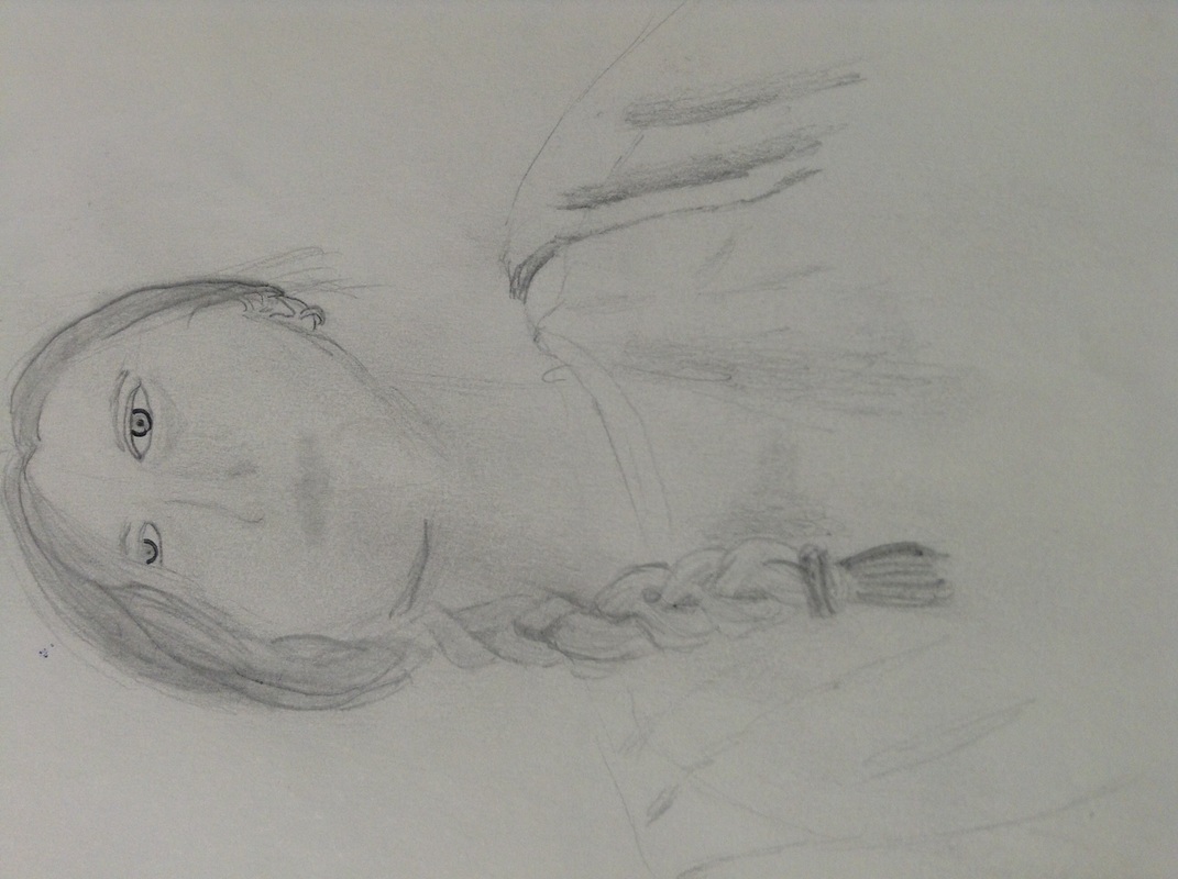
This is my alternate project. It is currently unfinished but when I do finish it I will update this post. I have done some more since this picture was taken.For the majority of the piece, I did it free handed with no chalk as a guide line. For the dead tree on the right I did use chalk and scratched around the chalk.
I used these websites for tips on techniques to use on scratch art: http://juliannakunstler.com/art1_scratch_art.html#.Vx4wRPkrLIU http://www.artistsnetwork.com/articles/art-demos-techniques/scratchboard-art-steady-hand-studied-technique
I learned from the two video clips Steal like a an Artist and Embrace the remix is what appropriation, parody, and intertextuality. I learned about remixes. That there isa10-page patented just for the Apple slide-t0-unlock start screen. The quote "Good artists copy, great artists steal," by Steve Jobs was originally said by Picasso. Nothing is truly original. When you make a remix you copy, transform, then combine different elements from other things. You take something that has already been done and add your own little touch to it and just mix it up. Interpit that as you will.
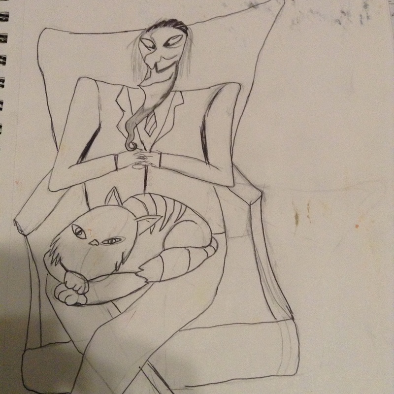
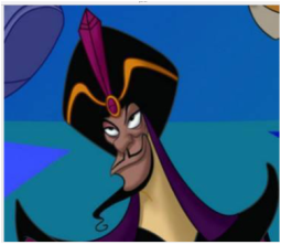
Appropriation is using someone else's idea and changing or adding very little. A parody is remaking an idea or image in a different style or in a funny way, basically giving it a make-over. Intertextuality is basically shaping he meaning of two things by combining them. For My inal art work I copied Jafar's face, the cat, and the chair along with the pose. I basically remade Jafar as your classic, evil, cat guy, movie villain. So I'm pretty much making fun of Jafar's evil schemes to get what he wants and how they always fail. Which would make my piece a parody. I originally did this in pencil then went over it in pen. For this assign ment whenever picturing what I wanted to do I just always pictured him in a suit, with a cat, sitting in a big oversized chair potting world domination. I created my art with limitations that I placed on myself. I could not use my thumb or my dominant (right) hand. I choose this because I have fairly decent left-hand control and when I write I do so in a way that allows me to not use my thumb. When I started it was difficult because I kept wanting to use my dominant hand and I just hand to keep reminding myself to use my left-hand. At first I used markers then I went to use paint to get the color I wanted for the water. I had a lot of difficulty painting in between the leaves with my left hand because it kept wanting to shake for some reason. From the videos we watched in class on limitations, I learned that if you set limitations for yourself it can actually help you be more creative and force you to find new and interesting ways to express yourself. Some limitations you can't help like having a physical or mental disability. So focus on what you can do not what you can't. It isn't always easy but it will be worth it.
I learned the difference between stealing and copying. Stealing is taking an idea and making it your own. Copying is taking an idea and claiming it as your own. Has a 20 page patented to the slide to unlock. New media is created from old media. Steve Jobs said, "Good artists copy, great artist steal."(originally said by Picasso.)
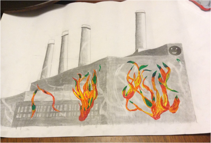
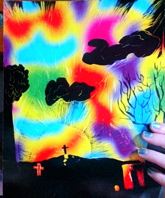
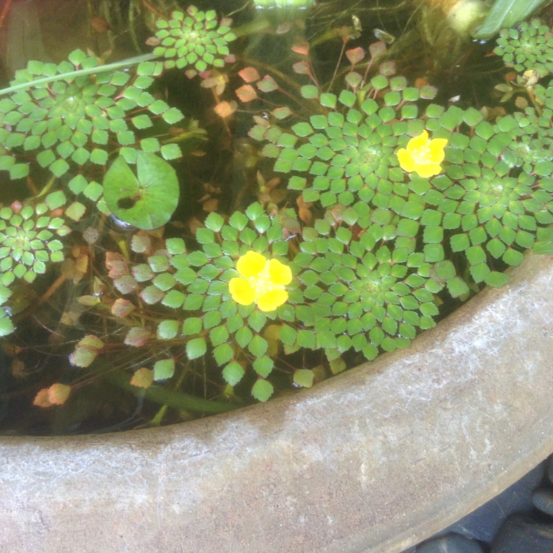
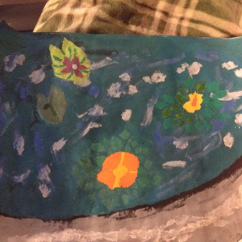
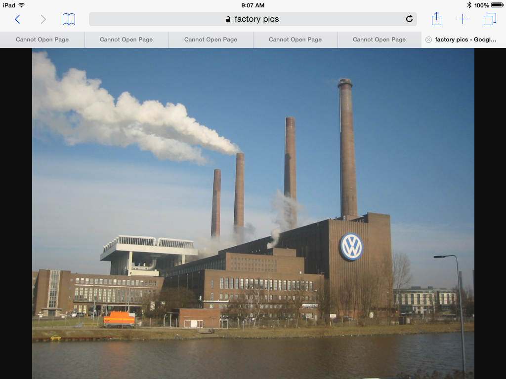
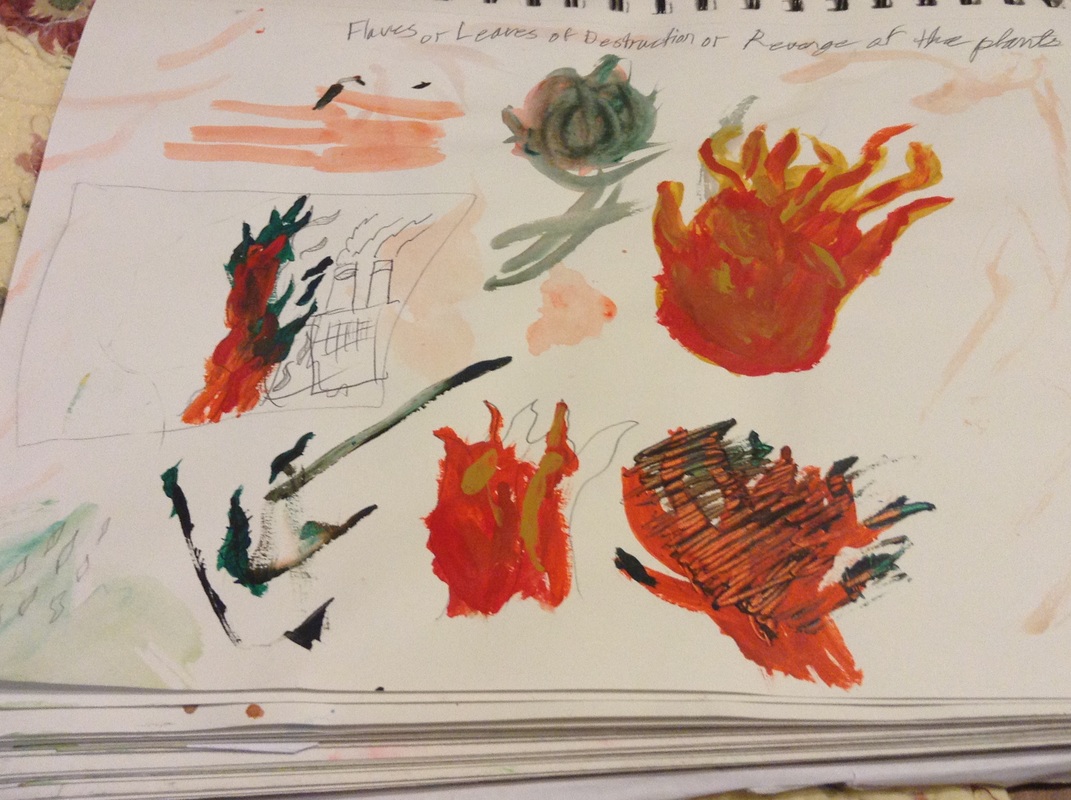
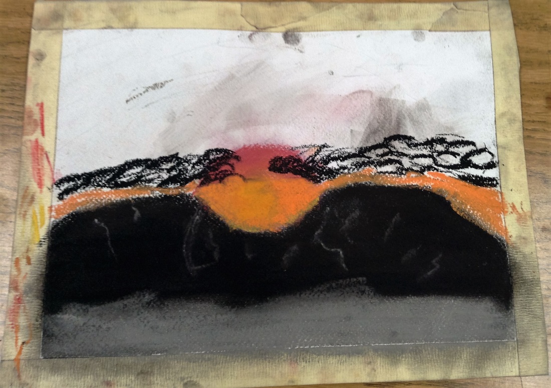
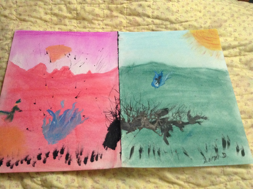
Appropriation is taking someone's idea and having little to no change. Parody is taking an idea or image and making it in a different style in a funny way. Intertextuality is to combine the relationship between 2 thing. The technique I used was intertextuality for this piece and a parody for the remix. The idea for the Two to One project stemmed from history class. We had a bit of free time and Krystal was perfecting her leaves on her flower so I drew one to. I decides the outline of it looked more like a candle flame so I drew a candle underneath it so it looked like it was lit. Krystal asked me if I was trying to burn down her flower with my candle. I told her no if I was I would use a flamethrower because that's much more fun. then I went back and drew a few lines on my flame and she said it looked more like a leaf. I decided that it was a cool idea to have flames that turn into leave and the are burning down factories. There is a method called slash and burn for clearing land. People usually build on this land and it is hurting the earth. So Mother Nature is fighting back and is going to use the slash and burn method to clear away the factories for her forests. For the factory part I used a graphite pencil, a pink eraser, a ruler, and a kneaded eraser. then I went back and erased part of the factory and noticed it made some interesting designs in the shaded areas, almost like flames. So wear I erased was wear my flames were and I used some fine point markers for the flames. This unit defiantly made me less afraid of drawing inspiration from other artwork. 1. I learned that by limiting my color choices to a specific scheme, triadic, it is a bit more difficult to create a piece that looks realistic, but I believe I managed to pull it off. The only colors I could use were black and white, red-violet, yellow-orange, and blue-green. 2. I definitely will be using color schemes in the future. It forces you to be creative and think outside the box. 3. I learned that when using mediums(art supplies such as the chalk pastel used in this piece) that mix very easily it is better to do the lighter colors and the things that are farther back from you view point first. Then go back and add in the dark colors and objects that are closer to the viewer. Also when overlapping light on top of dark, outline the boundary and color the light colors first even if it is before the dark colored object. I did this from memory. I saw it one morning while ridding the bus to school and immediately new that was what I was going to use for my color scheme project. The coloring is different from what I saw, but the image is as accurately as I was able to make it from memory. I had a lot of difficulty with buttes blending with my sky because I did the buttes first. I had to erasing and blend a ton to get the right shading but all in all I'm vey pleased with how it turned out. 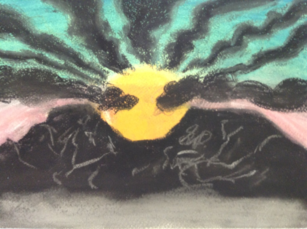 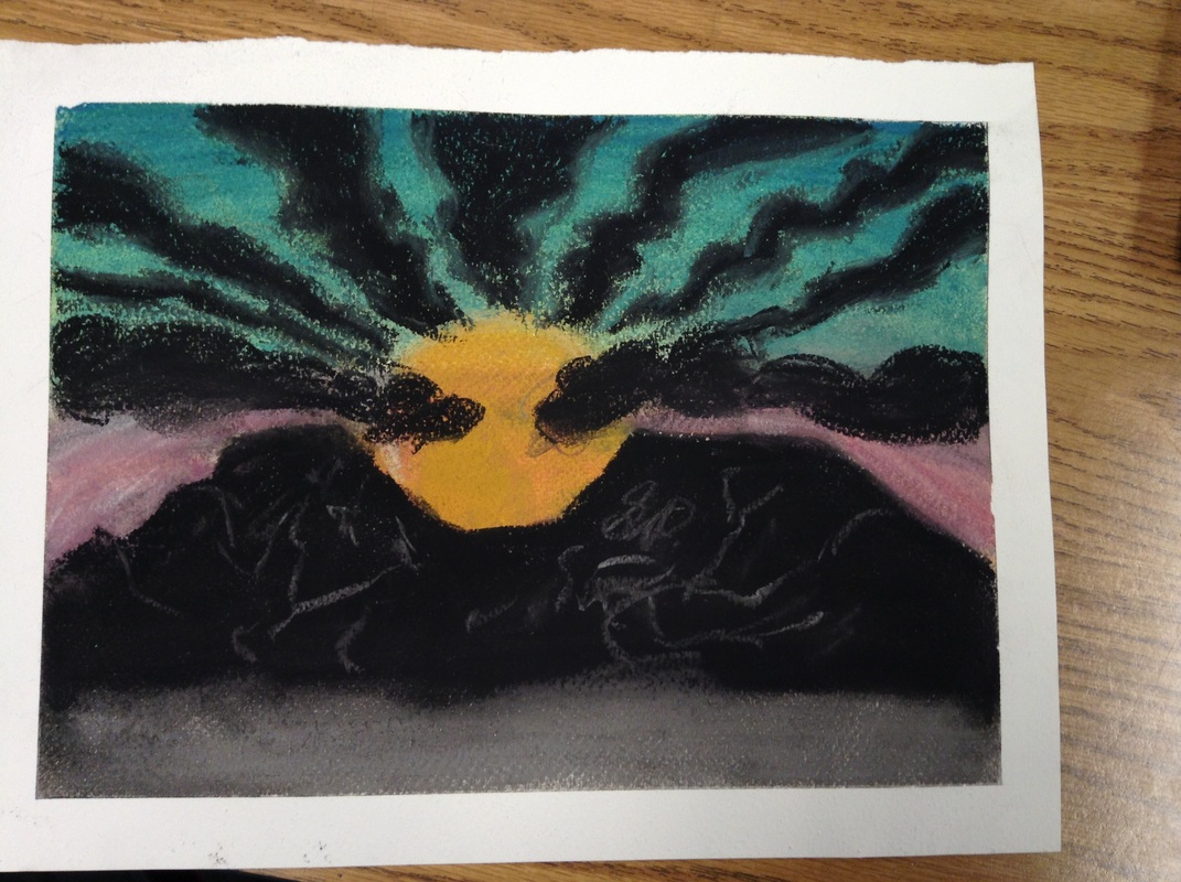
1. I am using a triadic color scheme with the colors red-violet, yellow-orange, and blue-green. I choose this color scheme because they were colors that I might be able to make work with a sunrise.
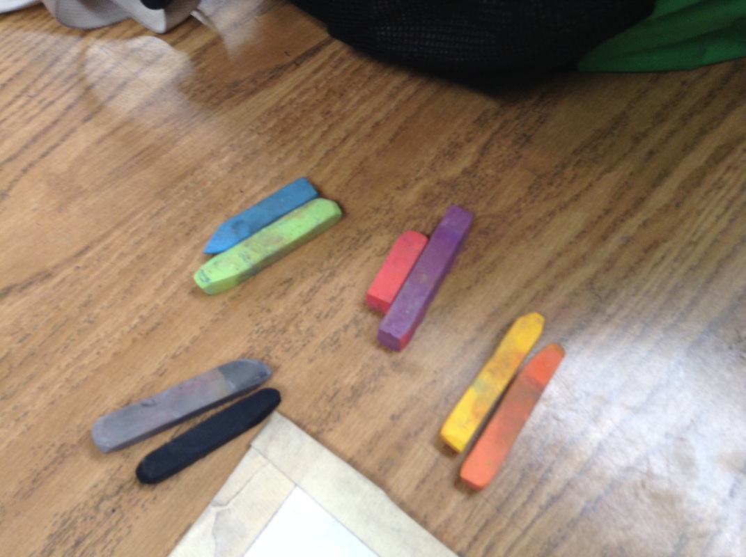
2. I am finding it very difficult to get the exact look I want in the sun, sky and mountains, but I believe I'm going to have the worst trouble with the clouds. I have managed to improve the sun some ,but it's still not what I'm aiming for. 3. I plan to finish my piece with black and grey mountains, yellow-orange and blue-green sky, and I will have grey/black clouds. This piece was inspired by something I saw on one cold miserable morning on the bus ride to school. The sun was rising in between two buttes but the way it looked, the buttes were completely black and so were the clouds that partially covered the sun. The sky was cloudy. The clouds were in a wavy shapes with greyish-white light showing through in between each individual wave. It looked almost uniform. I wish more than ever I had taken a picture. I would have gotten a picture but by time I was able it was behind the bus. I used chalk pastels and charcoal because of how easily it blends. I also put tape around the edges so I would have a nice clean border. |
SarahI enjoy cycling, swimming, and art. Archives
May 2016
Categories |


 RSS Feed
